Outer ring
Internet-facing.
What an attacker reaches first.
A spatial, guided map of your attack surface. Every asset in its exposure ring, every finding on the asset it concerns, and the real MITRE attack path animated from the internet to your data. In any browser, and in a VR headset with no vendor SDK.
A guided tour walks the MITRE attack path from the internet-facing entry to the crown-jewel assets, opening each asset's vulnerabilities as it goes. Findings with a fix show a “View remediation (PR)” button, and assets carrying a proposed pull request show a small git marker. The same scene renders in a VR headset over WebXR.
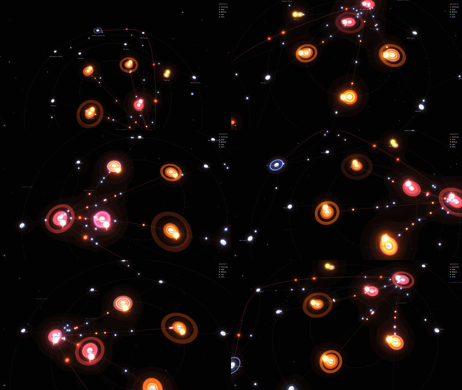
Between those two shapes is where most infrastructure maps fail, and closing that gap is the entire point of this view. Below is our reasoning, stated plainly, and what it changes for the person who has to act on the results.
Draw every asset as an equal box on a grid, colour a few red, and you have described inventory, not risk. The reader still has to reconstruct in their head the one thing that matters: which asset an attacker reaches first, and what it costs them to get from there to the data. Two failures dominated our first attempts. Findings piled onto whichever node the crawler anchored on, so one box carried dozens of issues and the rest looked clean, the opposite of the truth. And the layout carried no notion of exposure, so a database of password hashes and a public marketing page sat at the same altitude.
Learn moreWhat an attacker reaches first.
What runs on top.
What a breach is actually about.
Position tells you what is exposed and what is close to your data, before you read anything.
Not a generic diagram, the actual chain from the internet to the finding that matters.
The guided narration explains the breach in plain language to an executive or a developer.
On Pro, the same finding leads to a remediation pull request, reopened only after the original exploit no longer fires, and the whole surface can be walked in a headset.
A map that only shows risk still leaves the work to be done elsewhere. This one does not stop at visualisation: on DarkMoon Pro, every finding the remediation agent can address is linked to a proposed fix, opened as a reviewed pull request against the target’s own repository. In the vulnerability panel each such finding exposes a View remediation (PR) action, and on the map any asset that already carries a proposed fix shows a small git-PR marker, so you can move from an exploit path to the patch that closes it without leaving the view. Every pull request is generated for human review and is never merged automatically. It is reopened only after the original exploit no longer fires and the regression check passes.It sits on top of the same engine that produced the findings. The 2D graph is the default everywhere, the VR view asks only for a WebXR browser and a secure context, and none of it requires a vendor SDK. Read the longer engineering write-up on the blog.
DarkMoon is open source and self hosted. Clone it, point it at a target you own, and open the map in your browser.