DarkMoon research series·B. Data visualization & UX·Article 13 of 23·All 23 articles
Introduction
Most design write-ups show the final screen. The DarkMoon visualization research repository treats rejected attempts as first-class results, and this article follows that rule. It covers the redesign of the DarkMoon Pro Angular dashboard between late September and 20 November 2026: what we tried, what the product owner rejected, what we reverted, and what remained in production.
Owner quotes below are translated from French and labelled OBSERVED (from review notes); reverts are VERIFIED git objects in the private Pro repository, cited by short hash.
Problem
The dashboard had to show pentest results to two audiences (operators and decision-makers), on screens from 1440 px down to 320 px, in light and dark themes, without ever presenting a hypothesis as a proof. Before November 2026 the team had no stable design system: successive reference products were used as style sources, and the global stylesheet list still records their names.
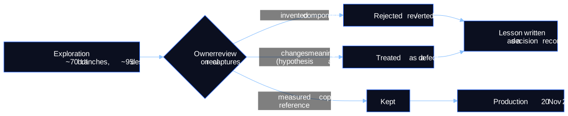
The volume of exploration was large. A branch census found about 70 UI branches and ~120 worktrees created between late October and mid-November 2026; the 6 fe/* exploratory branches were never merged (VERIFIED).
Methodology
There was no user testing with external participants. The method was:
- Owner review rounds on real captures of every screen (OBSERVED).
- An AI design-review skill that had to choose between open options and cite its rule, with a fixed precedence: owner's words > brand charter and kit > generic advice (OBSERVED).
- AI adversarial critics scoring captures. Their scores, such as 4.5/10, are internal LLM judgements, not usability measures (OBSERVED).
- Measure the reference. When a reference kit existed, computed styles were compared with Playwright until zero deviation, then per-component pixel diffs (OBSERVED).
- One structured study for the campaign header: 20 mock-up boards scored against four owner complaints (empty space inside the box, overlapping borders, wrapping rows, views not visible on phones).
Real results
What failed
| Date (2026) | Attempt | Outcome | Lesson recorded |
|---|---|---|---|
| 26 Sep | Rebuild the orbital graph « in its own way » | « That is not it at all »; lab engine reused | improve the artefact that was liked, do not rebuild it |
| 29 Oct | « Le Brief » hybrid dashboard (plain-language brief, very large figures, Guided/Expert switch) | « very very ugly »; internal AI judges 4.5/10 twice | AI judges are not a substitute for the owner |
| 29–30 Oct | Invented cards (activity chart, severity bars, « Top risky targets ») | « I forbid you to invent cards, modernise what exists »; reverted | add information, never filler |
| 30 Oct | Full-screen 3D dashboard and editorial variants | « that's not a dashboard » | 3D is an accent (infra map, path focus) |
| 30 Oct | ~15 fintech style layers | « too banking, not cyber enough » | domain tone matters |
| 30 Oct | Liquid glass, severity emblems, ambient field | 4 reverts | effects without a job are removed |
| 30 Oct | Node-editor flow graph pixel-matched to a design shot | « no smooth transitions »; never merged | a reference is a mood for an experience, not an image to trace |
| 31 Oct | ~95 « night hunt » design lots | « no look kept » | volume of options did not converge |
| 3–4 Nov | Kit skins; invented sidebar, project tree, rails, matrices | rejected | measure the reference, then reproduce |
| 5 Nov | Card border, grain, glass and gap experiments | 17 reverts | — |
| 18 Nov | Wording change on agent-declared link labels | reverted (gain not demonstrated, n = 1) | do not change vocabulary without evidence |
| 20 Nov | Space Mono display face in the product UI | retired site-wide; kept only in the PDF report | brand fonts belong to documents, not to dense UI |
What held
| Date (2026) | Change | Evidence | Why it held |
|---|---|---|---|
| 26 Sep | Fix the map data before the renderer: server-side finding attachment | lab test 57/57 findings attached (OBSERVED, one lab campaign) | removed the « all findings on one node » defect that no restyle could fix |
| 29 Oct → 6 Nov | « Exposure path · not proven » wording; guided story only for proven paths | commits (VERIFIED) | never presents inventory as an attack |
| 1 → 9 Nov | Reference kit copied with locked tokens, on real fields only | 33 per-lot branches merged (VERIFIED) | measured copy instead of invention |
| 3–4 Nov | ELK layered path graph; operator-declared paths as a never-counted class | commits (VERIFIED) | deterministic reading, clear provenance |
| 17 Nov | Reserved heights for asynchronous cards | dashboard CLS 0.1065 at 1440×900 → fixed (VERIFIED, Playwright layout-shift observer) | measured layout stability |
| 19–20 Nov | Treatment plan by asset × weakness class | 66 per-finding fixes → 14 actions (VERIFIED, captures) | removes contradictory counts |
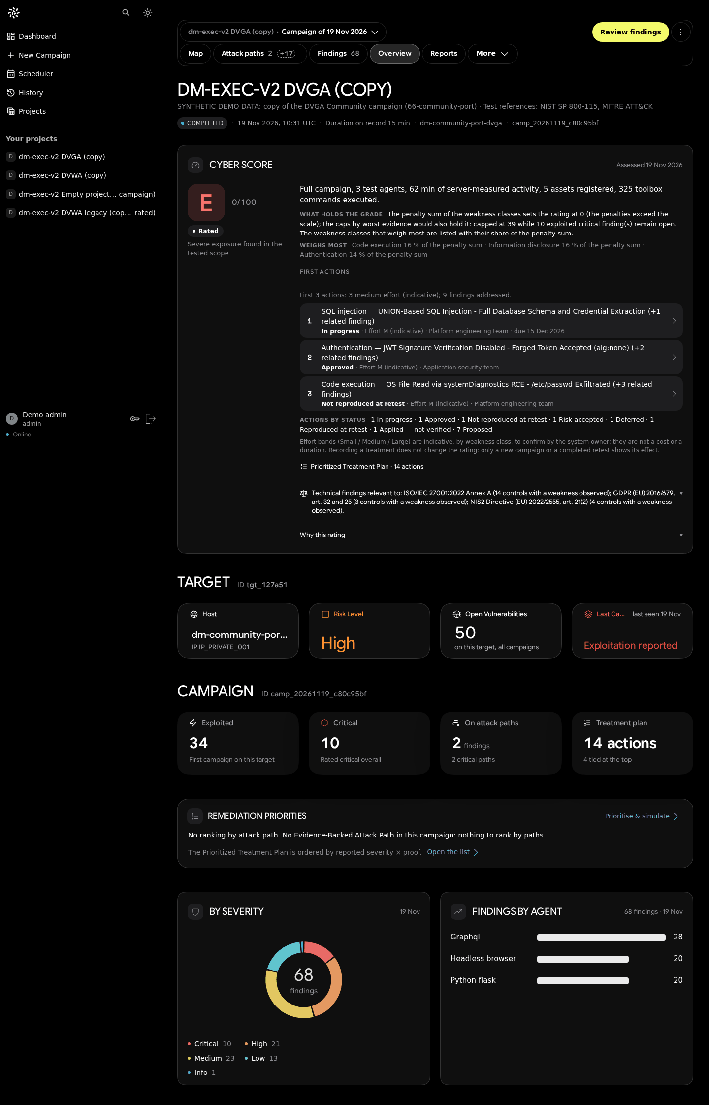
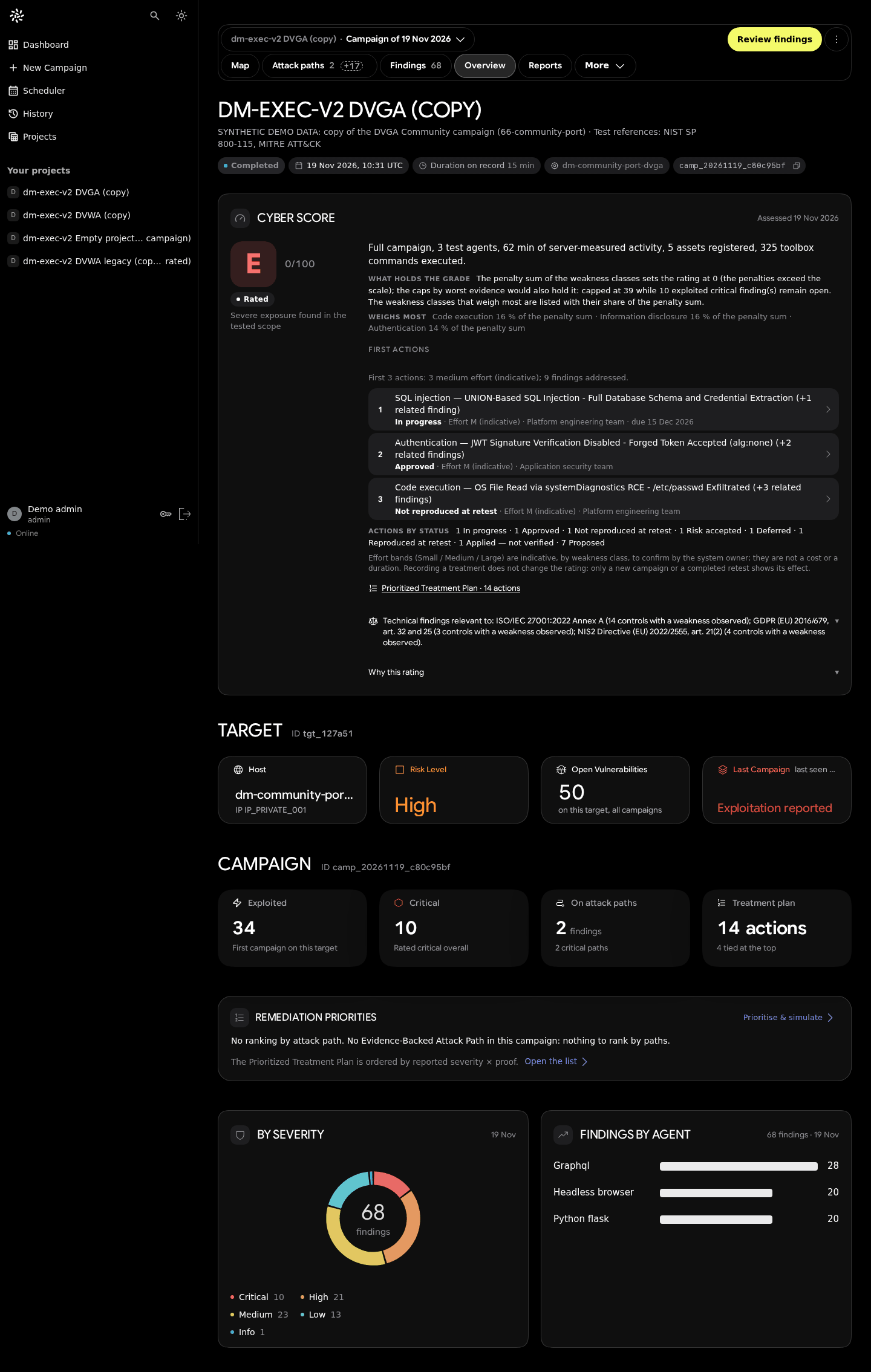
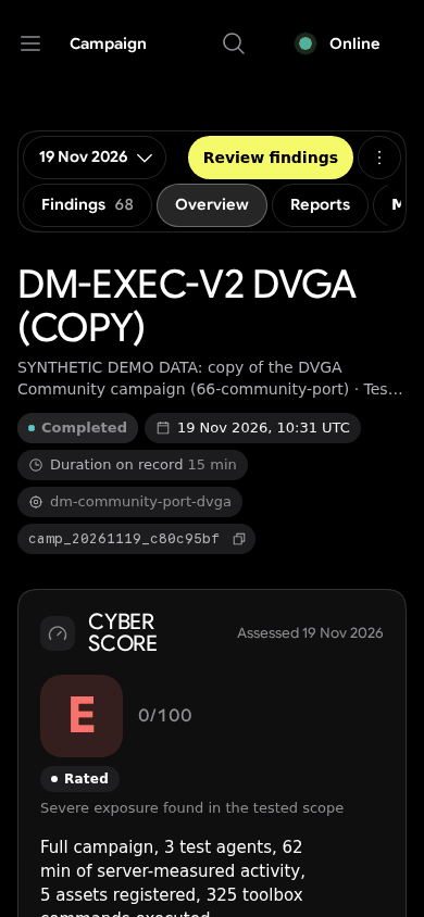
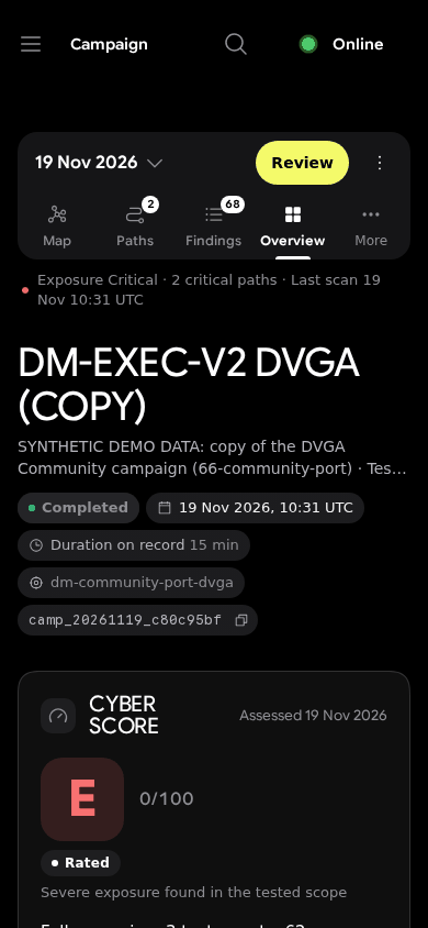
| 20 Nov | Board 13 campaign header; old rules deleted from 11 stylesheets instead of out-ranked | commits (VERIFIED) | no void, no overlapping borders, every view visible on phones |
The study that the owner overruled
For the campaign header, the study produced 20 mock-up boards rendered at 1440, 834, 390 and 320 px. Its ranking was Board 02 > 01 > 07. The owner chose Board 13, which the study had rated « heavy on desktop ». No user test arbitrated between them, and the repository says so (UXDR-16).
A technical detail mattered as much as the visual choice. The old header was styled by five stacked layers using !important and specificity chains up to 24 :not(#id) selectors. Board 13 removed those rules from 11 stylesheets rather than adding a sixth layer on top (OBSERVED in the study's design-system notes; VERIFIED commit body).
The pattern behind the verdicts
Read together, the rejections share one property: the owner's strongest objections were epistemic, not aesthetic. Two figures for one notion, a hypothesis drawn like a proof, an invented card or narrative: these became rules. Style choices were accepted when they reproduced a measured reference and rejected when they were invented in between.
Limits
- No user study. No task time, error rate or SUS score exists for any version (not measured). « What worked » means « accepted by the owner and kept in production », not « performed better for users ».
- One decision-maker. Decisions reflect one product owner plus AI critics.
- Board 13 was implemented under time pressure; the post-deploy owner review is not recorded (UNKNOWN).
- Many rejected directions have no published capture, because those captures show lab addresses or unreviewed local data. The failures table rests on owner notes and git reverts, not on images.
- Performance was not part of the comparison. Production initial bundle 1.23–1.26 MB raw in three build logs (VERIFIED); no Lighthouse run on the Angular client (not measured).
- Rules were amended. « Never add a card » became « you may add cards if they are well made, no duplicates or filler » on 20 November.
Figures
- Figure 1 (Mermaid): the filtering process.
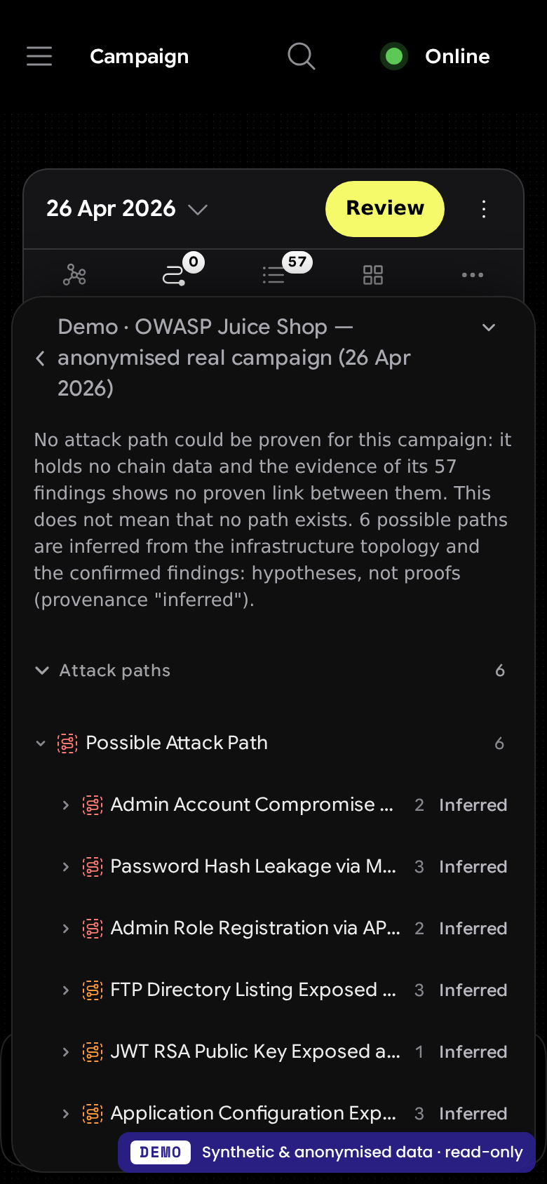
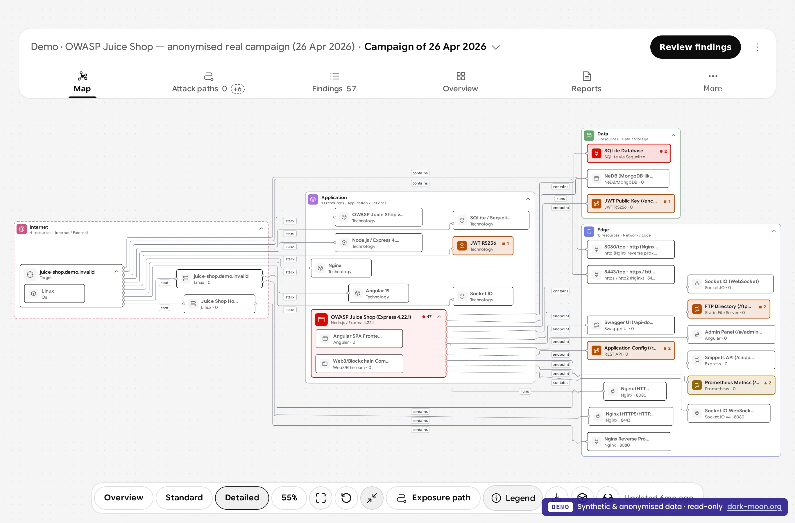
- Before/after pairs:
screenshots/comparisons/in the research repository (real UI, synthetic demo data). - The 20 boards: experiments/alternatives/campaign-bar-boards (mock-ups, not the product).
Scientific sources (verified)
- Nielsen Norman Group. « 10 Usability Heuristics for User Interface Design ». https://www.nngroup.com/articles/ten-usability-heuristics/
- Material Design 3 — Tabs. https://m3.material.io/components/tabs/overview
- Apple Human Interface Guidelines — Segmented controls. https://developer.apple.com/design/human-interface-guidelines/segmented-controls
- GitHub Primer — UnderlineNav. https://primer.style/product/components/underline-nav/
- W3C WAI-ARIA Authoring Practices — Tabs pattern. https://www.w3.org/WAI/ARIA/apg/patterns/tabs/
- W3C. Understanding SC 1.4.10: Reflow. https://www.w3.org/WAI/WCAG22/Understanding/reflow.html
All URLs fetched on 2026-11-20. The campaign-bar study's wider source list (VEILLE.md) was not re-verified for this article.
Research, source code & reproducibility
- Main research repository: ASCIT31/darkmoon-visualization-research: experiments/failures, experiments/successes, experiments/alternatives (study, scoring, 20 boards) and decisions (UXDR-04 to UXDR-16).
- Source code: ASCIT31/Dark-Moon is the open-source edition; its interface is the CLI and the Terminal Explorer (
conf/plugins/darkmoon-explorer). The Angular dashboard discussed here belongs to DarkMoon Pro, which is proprietary; its commits are cited by hash in the research repository. - Documentation: https://docs.dark-moon.org
- References: references/README.md.
- Reproducible experiments: the 20 boards, their scoring grid and the recommendation are published, so the study's ranking can be re-scored by anyone against the four stated complaints. The before/after captures carry commit, viewport and theme in
metadata.json.
Related reading: Progressive Disclosure in Vulnerability Management Interfaces · Redesigning a Cybersecurity Dashboard Around Attack Paths · Designing Explainable Security Graphs Without Misrepresenting Evidence · Building DarkMoon in the Open: Research, Benchmarks, Failures and Reproducibility
If you have run a structured comparison of navigation patterns for security consoles, we would be glad to read it; the research repository accepts issues and pull requests.
See the proof, not just the write-up: the Pro remediation benchmark (fixes retested against the exploit) · how Darkmoon compares to other AI pentest tools.
← All articles